Best Buy · Checkout · Design & Delivery
Building the Future of Checkout
Turning a concept into a scalable checkout — and protecting the experience through technical complexity, edge cases, and experimentation.
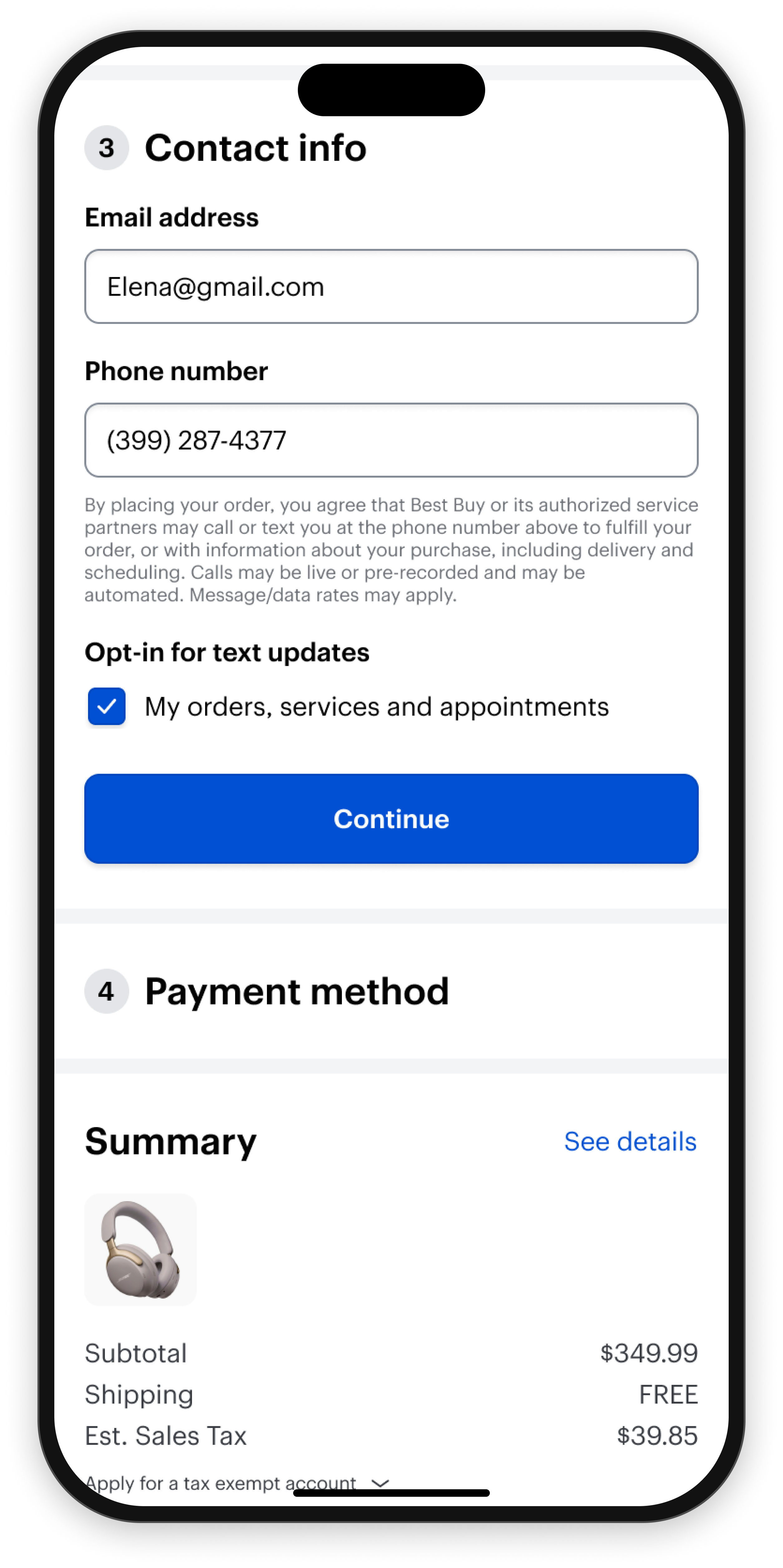
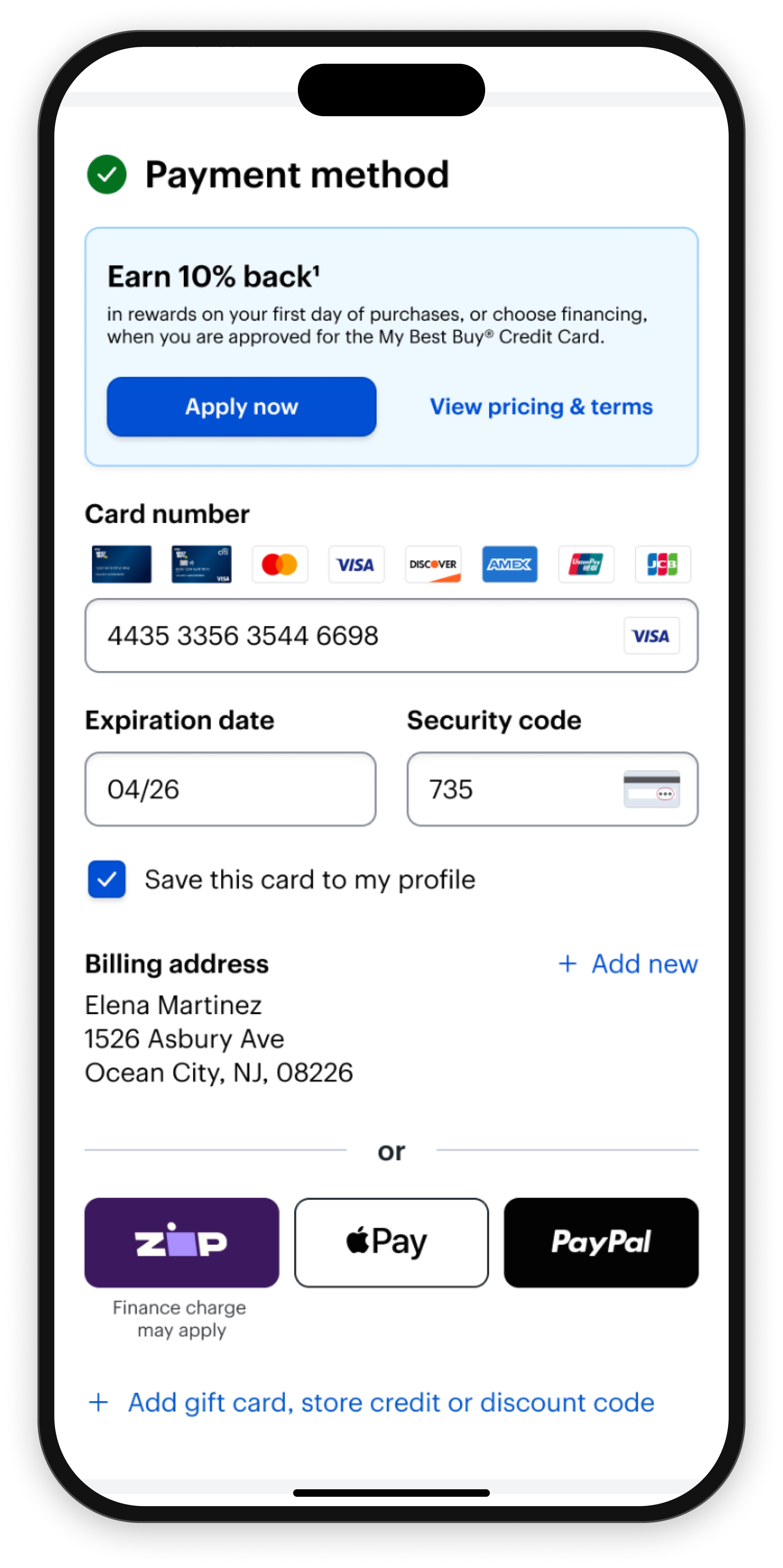
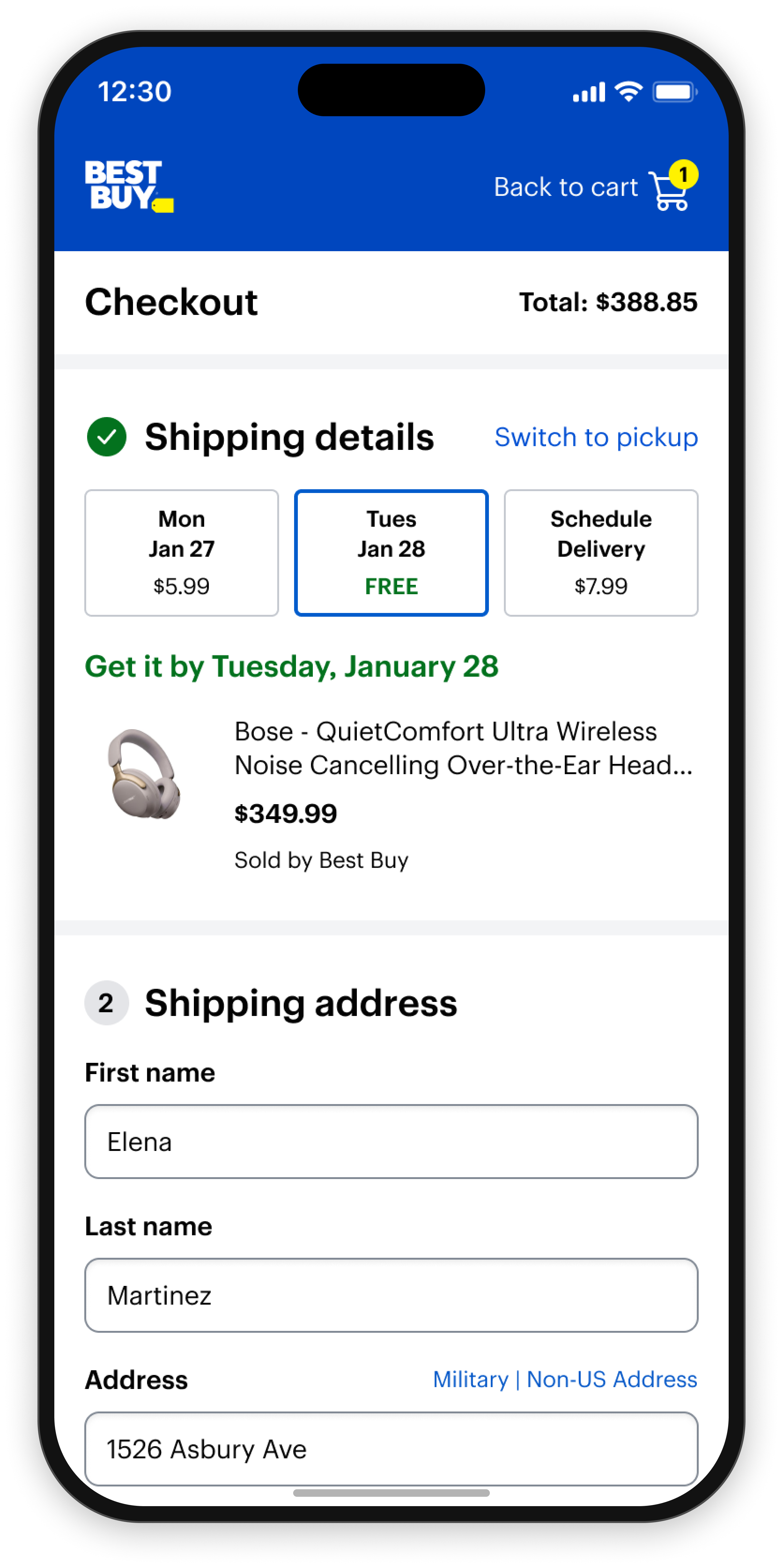
“Increase checkout conversion in the Best Buy app and mobile web experiences.”— Best Buy product leadership
Best Buy's previous checkout redesign had failed its A/B test. This time the direction was validated in discovery, but it still had to hold up through execution.
Discovery aligned the Commerce View, Payments, and Fulfillment teams on a single direction: a one-page accordion built around four customer needs, confidence, reviewability, control, and transparency. That first half of the process is covered in Defining the Future of Checkout.
My role was to protect that direction through execution, and turn it into a checkout that met the four customer needs and supported a business case the organization could commit to as the future of checkout.
A scalable checkout foundation
A single, extensible checkout the organization aligned on as the future of checkout — capable of supporting the complexity of modern commerce.
A checkout customers can trust
The four needs from discovery — confidence, reviewability, control, and transparency — translated into visible order details, editable steps, and a clear sense of what happens next.
Advocating for the Experience
A critical turning point occurred when I proposed interaction changes that better supported customer needs but expanded implementation scope.
The proposal introduced additional engineering complexity and challenged initial delivery assumptions.
This led to a series of discussions across Product, Engineering, Checkout, Payments, and Fulfillment.
After weighing short-term implementation costs against long-term customer value, the organization aligned around pursuing the stronger experience.
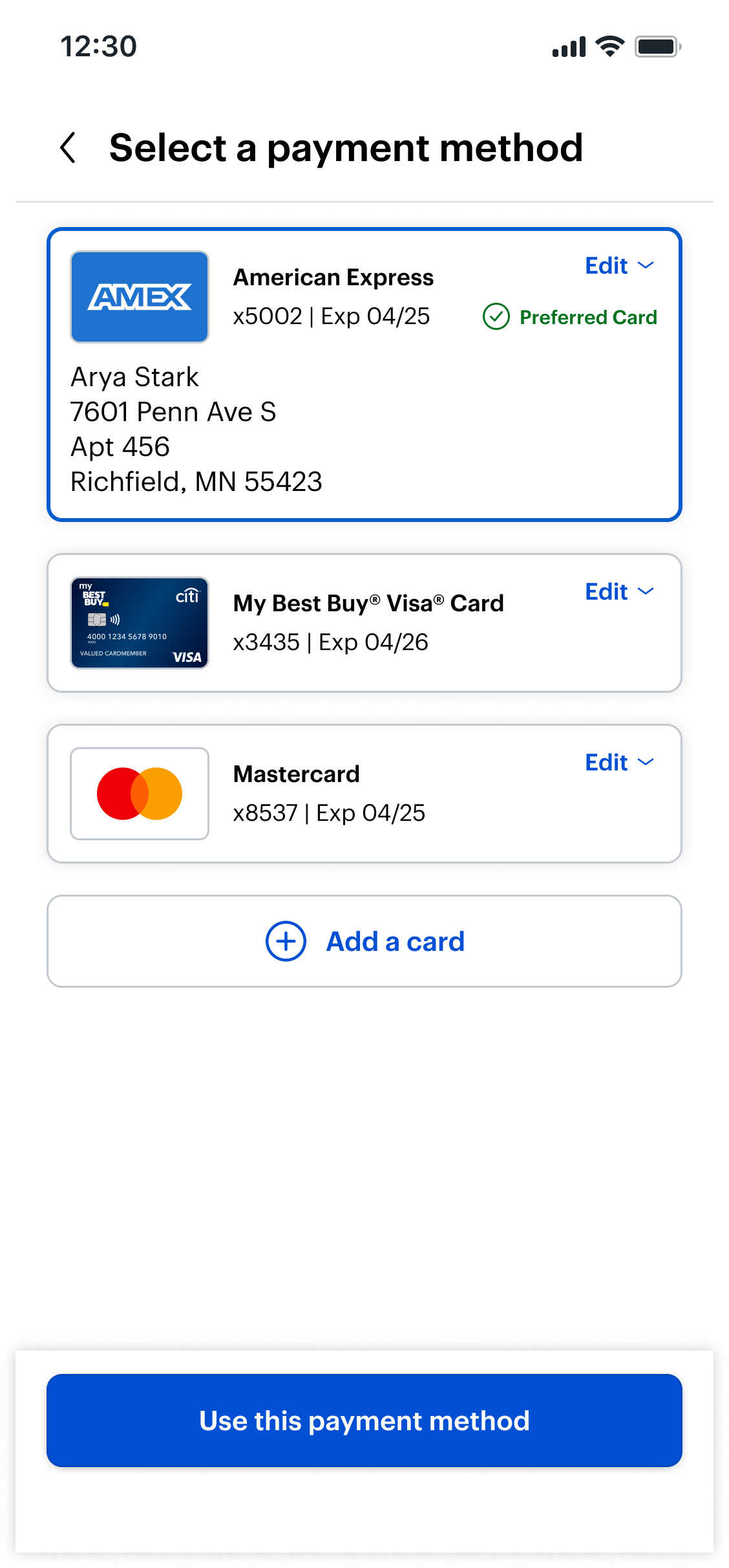
Before Inconsistent Spoke page interaction model
 Checkout stays in view
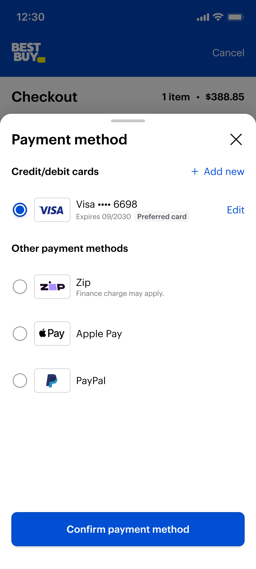
After Refined drawer & side sheet interaction model
Original Interaction Model
Proposed Interaction Model
The full page takeover gives each step the entire screen, with the most room to work with.
Keeps customers in the context of checkout. It feels like a lighter, quicker interaction, and creates one consistent pattern across every step.
Little to no dev lift, so we could test the experience sooner.
Heavy dev lift, requiring a full rebuild of interactions across checkout.
The cheapest, fastest path to a live test, favoring short term speed to market.
Higher upfront investment for a scalable, consistent checkout foundation.
Pursue the drawer model. The heavier engineering lift was outweighed by a consistent, in context experience that scales across all of checkout.
Designing at Scale
Designing the primary flow was only part of the challenge.
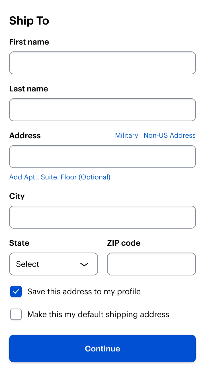
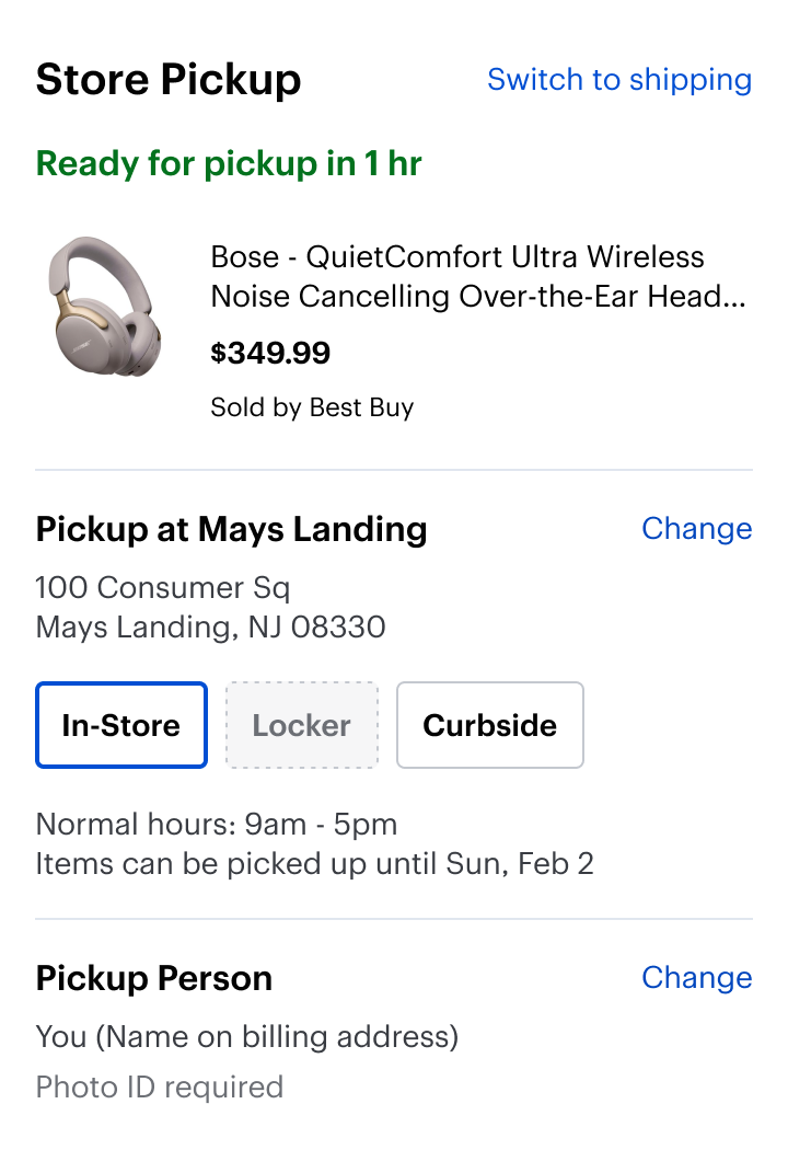
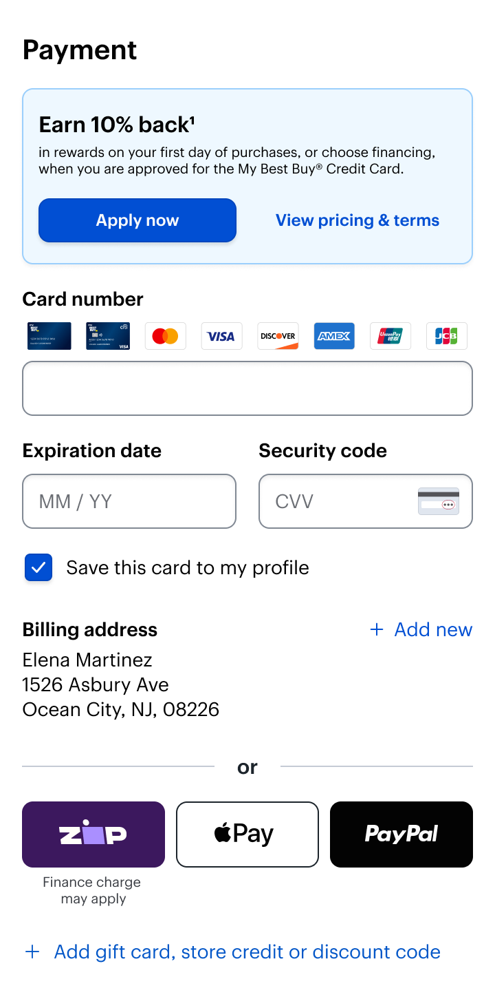
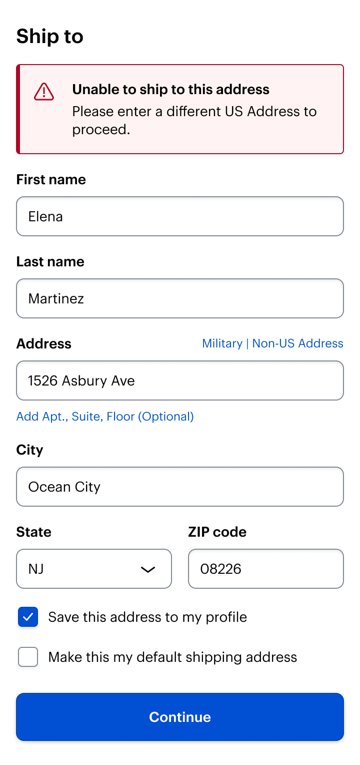
The experience also needed to support dozens of customer scenarios and edge cases.
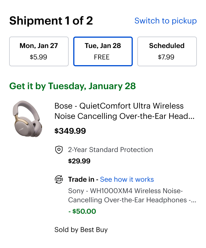
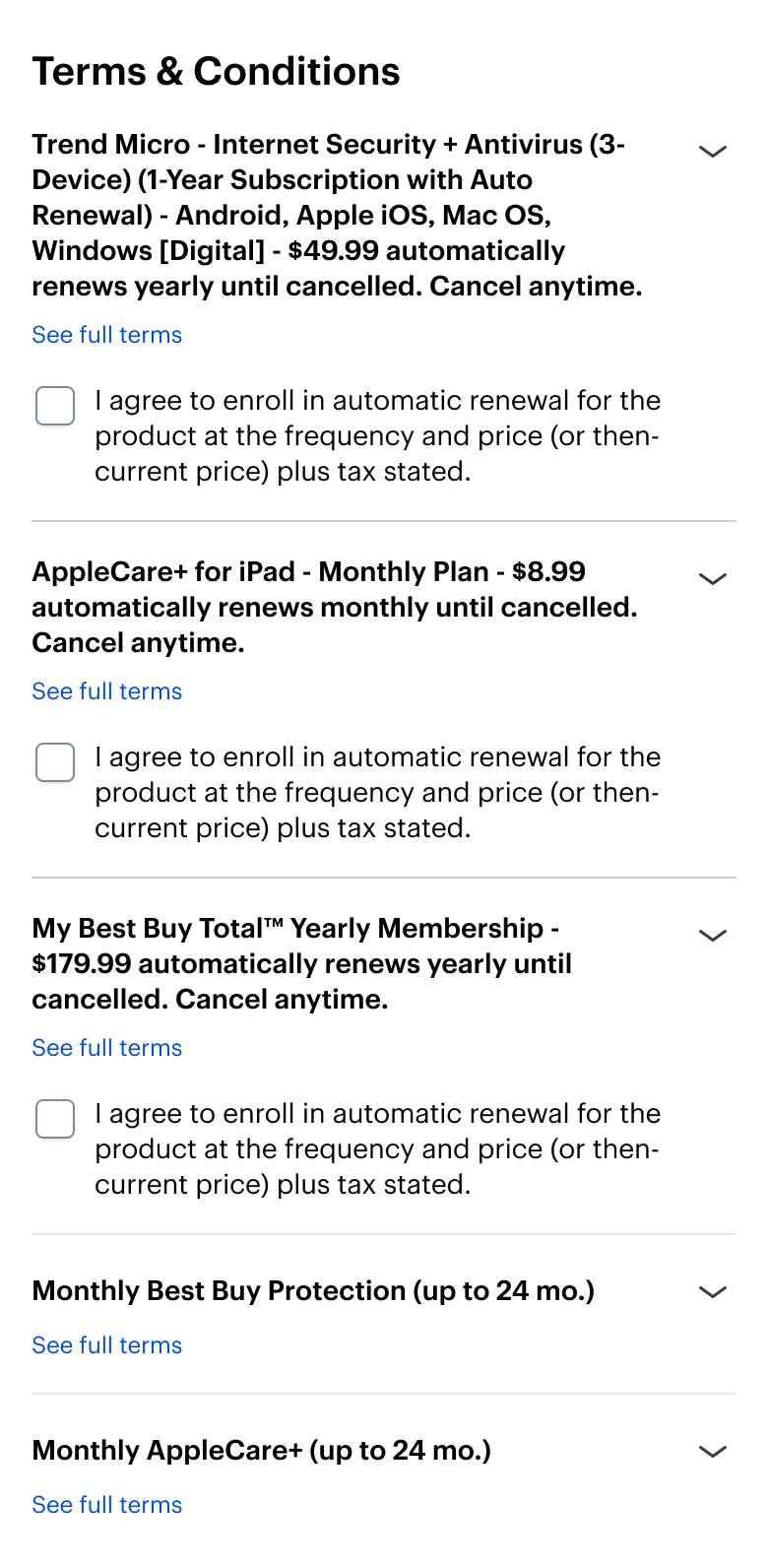
I partnered closely with the Commerce View (Checkout), Payments and Fulfillment teams to ensure consistency across every variation and ensure scenarios across every dimension were supported.
Testing Reality
Following implementation, the redesign entered A/B testing against the legacy checkout experience.
The initial results were disappointing.
The redesigned experience showed roughly a 1% decrease in conversion in the web experience, but flat in app.
At first glance, it appeared we had another unsuccessful checkout redesign.
The numbers we watched
To understand the full impact of the redesign, we looked past the headline conversion number to a focused set of metrics across the funnel.
App AOV
−$8 vs $335 control
Mobile web AOV
+$1 vs $310 control
Desktop AOV
−$2 vs $428 control
Almost all of the movement was in desktop conversion, down about two points, while app and mobile web stayed flat. The desktop result was the one we investigated next.
Questioning the Results
Rather than immediately abandoning the direction, the team investigated the results more deeply.
As we analyzed the experiment, we uncovered limitations within the testing setup that had not been fully understood before.
We found that a select few products carried 95% of the conversion detriment. All signs pointing towards reseller activity skewing the numbers towards the control.
With this discovery, along with identification of several bugs, our results proved inconclusive. We needed to iterate the designs, our testing setup, & our measures of success.
The Iterated Designs
The design advanced through iteration, with every decision backed by data.
Each step stays visible and editable while the flow guides customers forward. The direction from discovery, realized in high fidelity.
I worked in tandem with product and engineering to refine the designs while they resolved bugs, and controlled for resellers.



Outcome
The redesign established a new foundation for checkout at Best Buy.
More importantly, it translated customer insights into a scalable experience capable of supporting the complexity of Best Buy's offerings.
Although validation continues, the organization aligned around this direction as the future of checkout.

Confidence
Each finished step collapses to a completed checkmark, while the delivery date, savings, and running total stay in view. Customers can see the order is right before they commit.
Reviewability
The whole order lives on one page, backed by a persistent summary and a dedicated review sheet. Nothing hides behind a final confirmation screen.
Control
Every completed section keeps a Change action that reopens that step in a focused sheet. Customers can edit anything, in any order, without losing their place.
Transparency
Subtotal, shipping, and tax are itemized up front, delivery dates are explicit, and added costs like financing are labeled. No surprises at the end.
What I Learned
Execution required protecting that direction through technical complexity, organizational constraints, and uncertainty.
The challenge was creating a simple, elegant experience on top of an incredibly complex system.
This project reinforced that great product design requires more than interaction design. It requires systems thinking, alignment, and the ability to make thoughtful tradeoffs while staying focused on customer needs.
Defining the future of checkout
After a redesign failed its A/B test, I led the discovery that uncovered why and aligned three teams on a new data-backed direction.
View case study
The future of agentic commerce
Leading the design of Best Buy’s first AI-native purchasing experience — a complete checkout inside ChatGPT, across OpenAI, Stripe, and Best Buy.
View case study