Best Buy · Checkout · Discovery
Defining the Future of Checkout
Using collaborative data analysis to bring three different product teams together to align on a new vision for checkout.
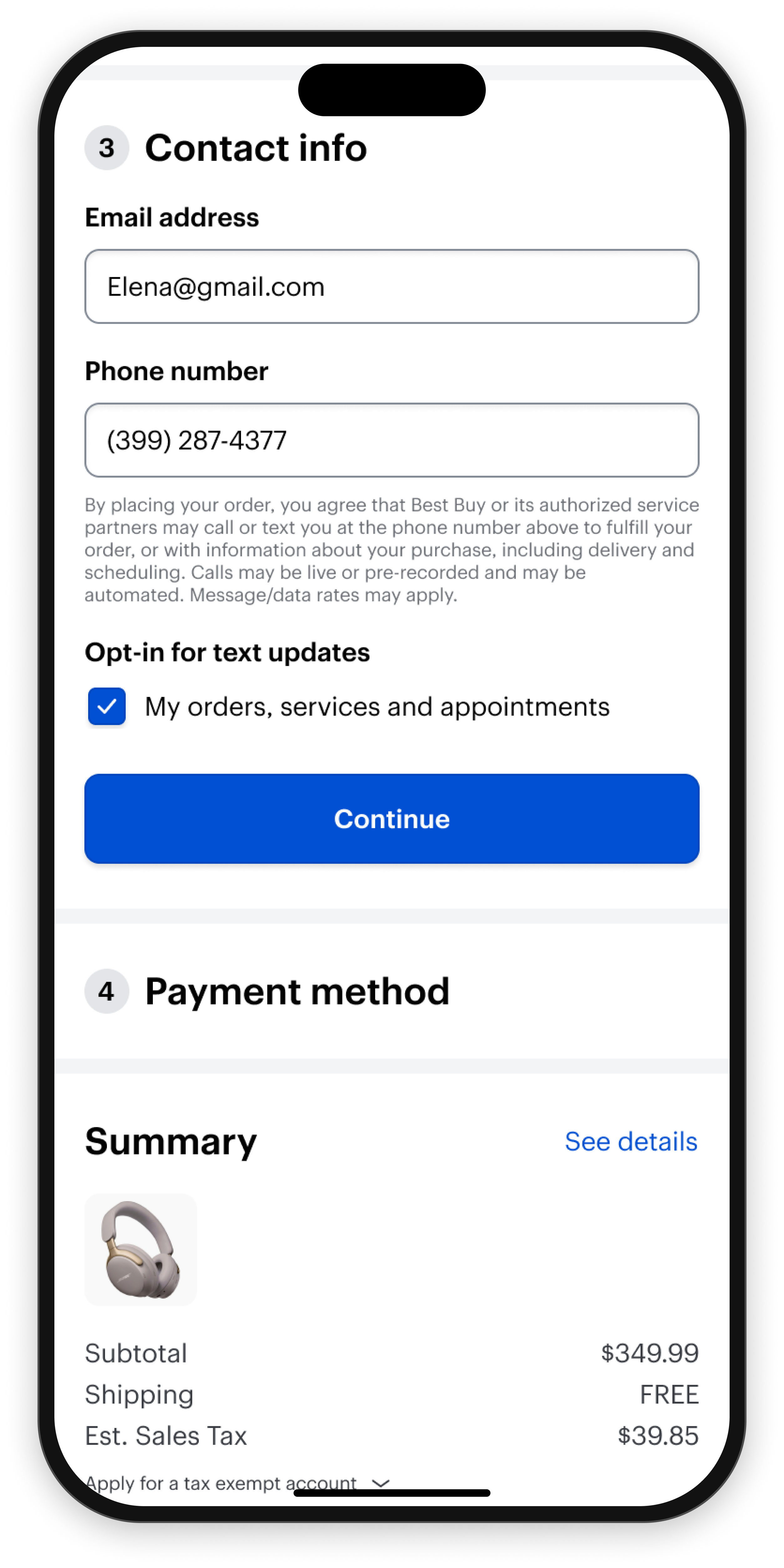
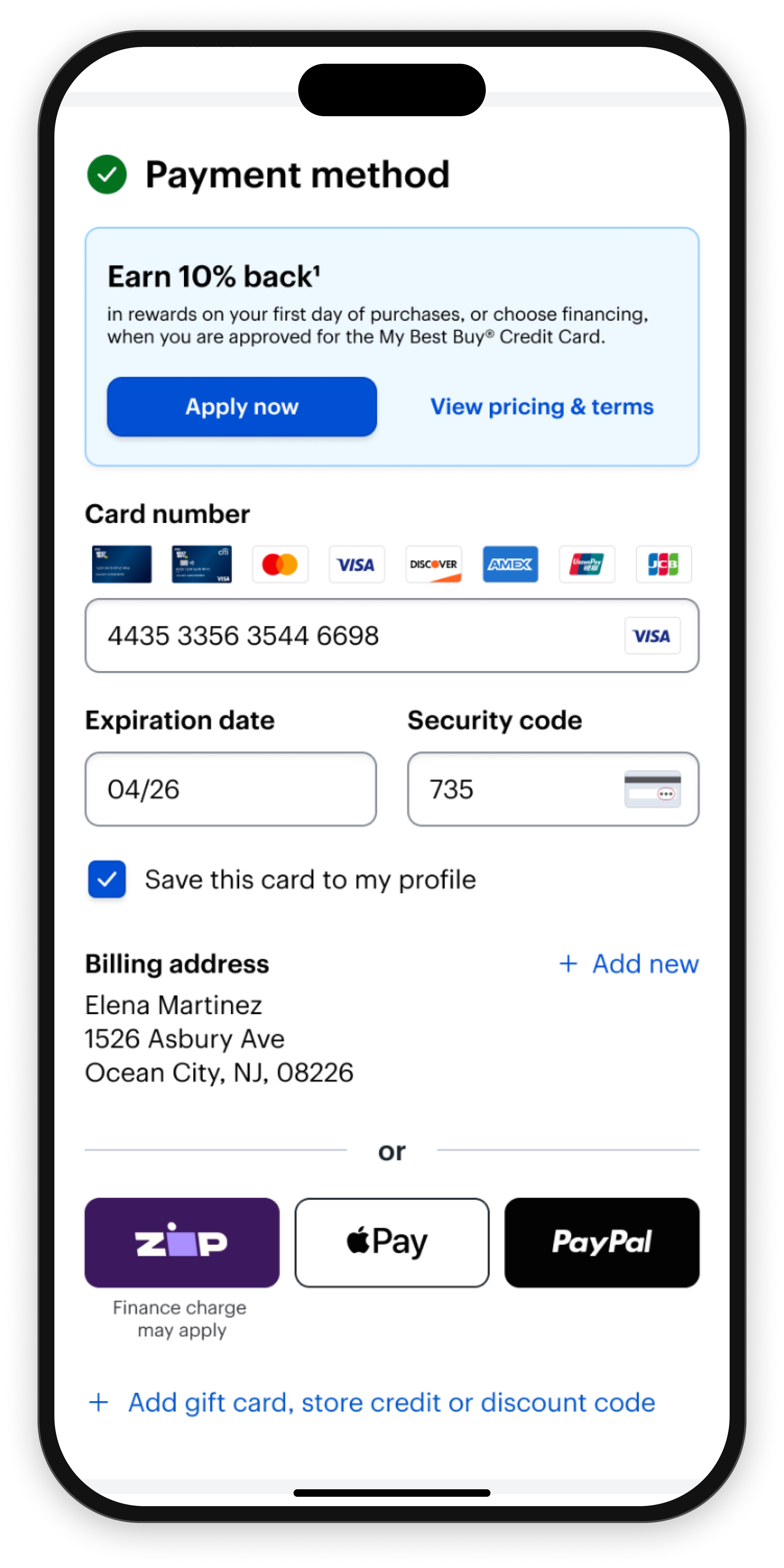
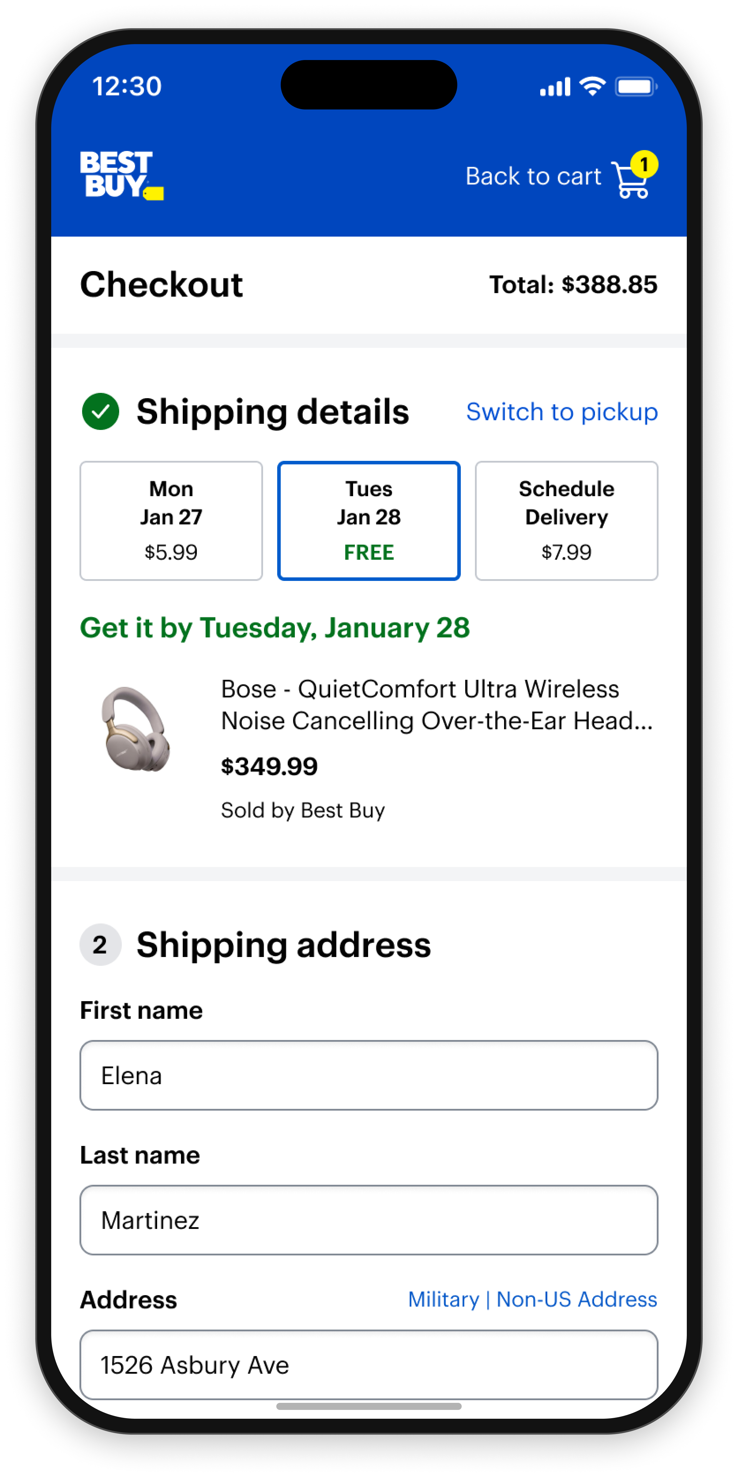
“Increase checkout conversion in the Best Buy app and mobile web experiences.”— Best Buy product leadership
The proposed path forward was a series of incremental improvements to the existing checkout experience. A previous redesign had recently failed an A/B test, making large-scale changes difficult to justify.
Before optimizing what already existed, I wanted to understand why the previous redesign failed.
- Mobile conversion lagged desktop
- Previous redesign underperformed
- Confidence in large-scale redesigns was low
- Three teams owned different parts of checkout
App checkout conversion rate
Mobile web checkout conversion rate
Desktop checkout conversion rate
Current · 2 pages


No review step — payment ends the flow.
Test · Multi-page, mobile-first
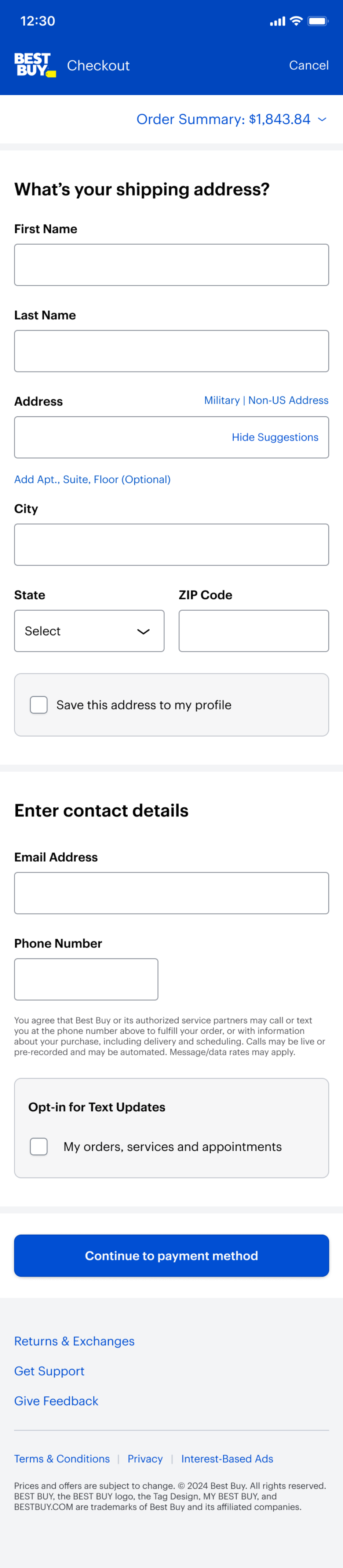
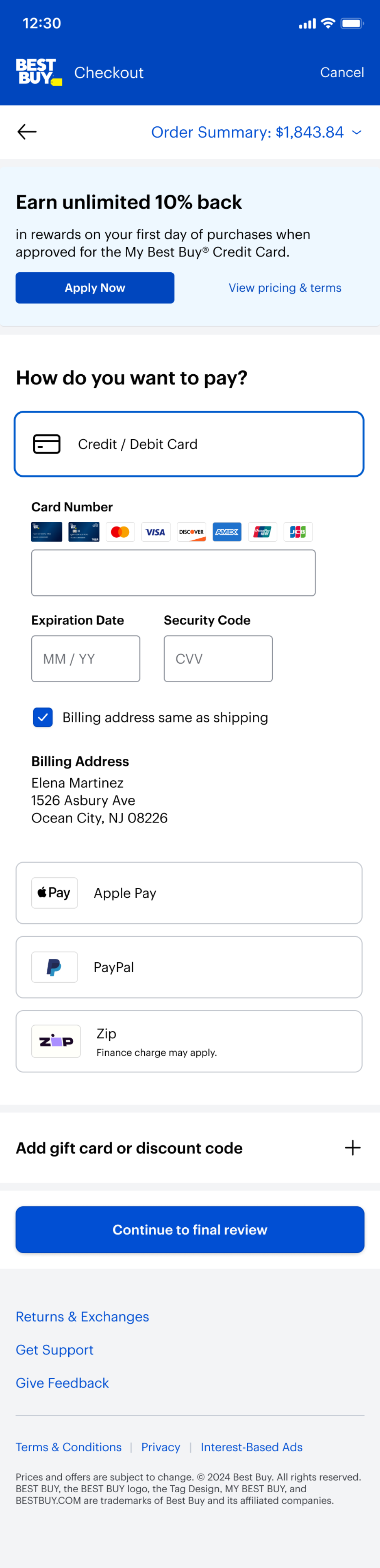

Fulfillment → Payment → Review.
A/B tests tell us which experience won. They don’t tell us why.
I organized a series of structured discovery workshops with Checkout, Payments, and Fulfillment to analyze the previous A/B test results as a team before deciding what to build next.
Inputs reviewed:
- A/B test analytics
- Adobe Analytics
- ContentSquare heatmaps
- Voice of Customer feedback
- Internal user research
- Baymard research
- Nielsen Norman research
Together, we reviewed data, surfaced observations, and identified patterns that appeared across multiple sources. Rather than debating solutions, we focused on understanding customer needs.
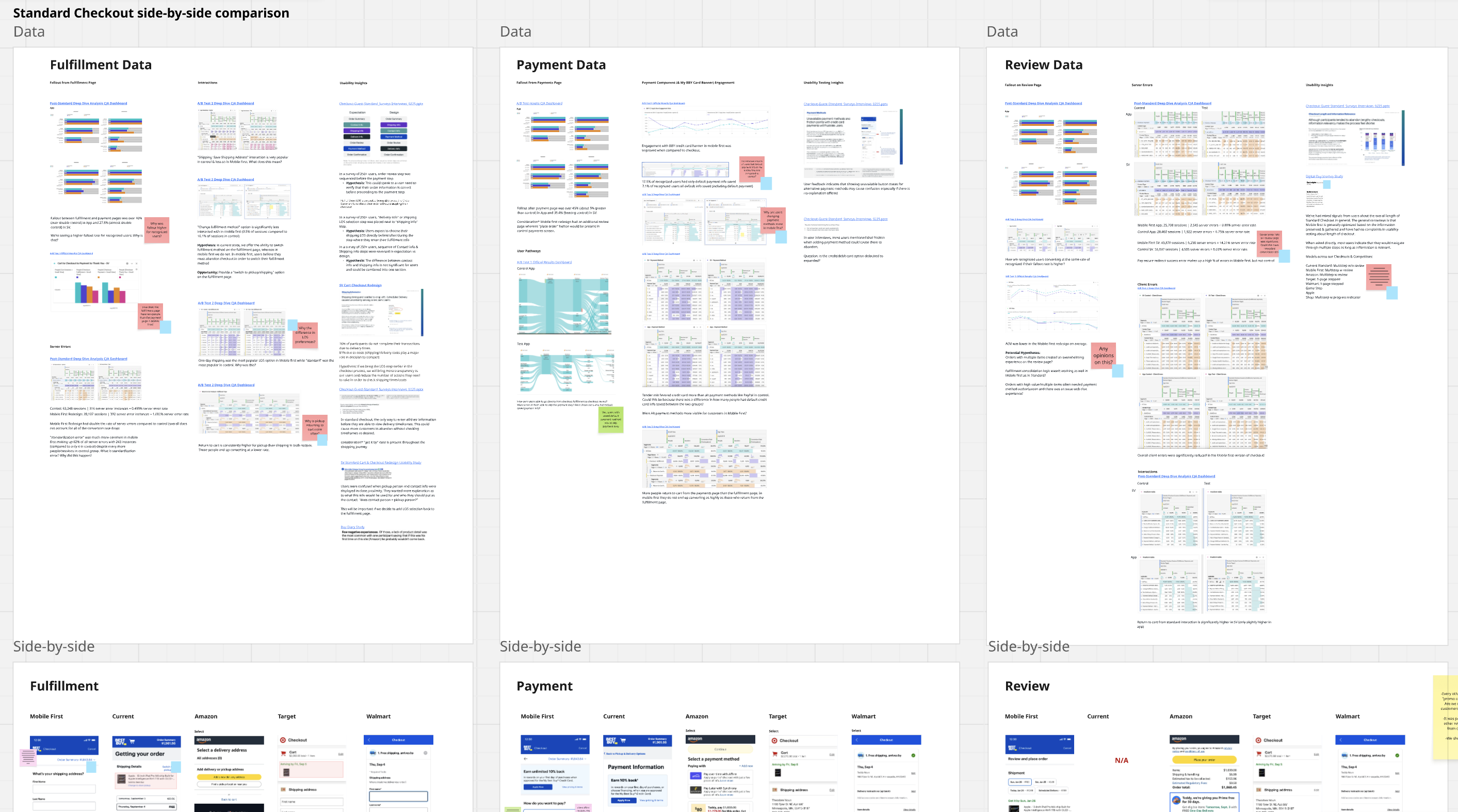
Synthesis board — fulfillment, payment, and review evidence clustered side by side
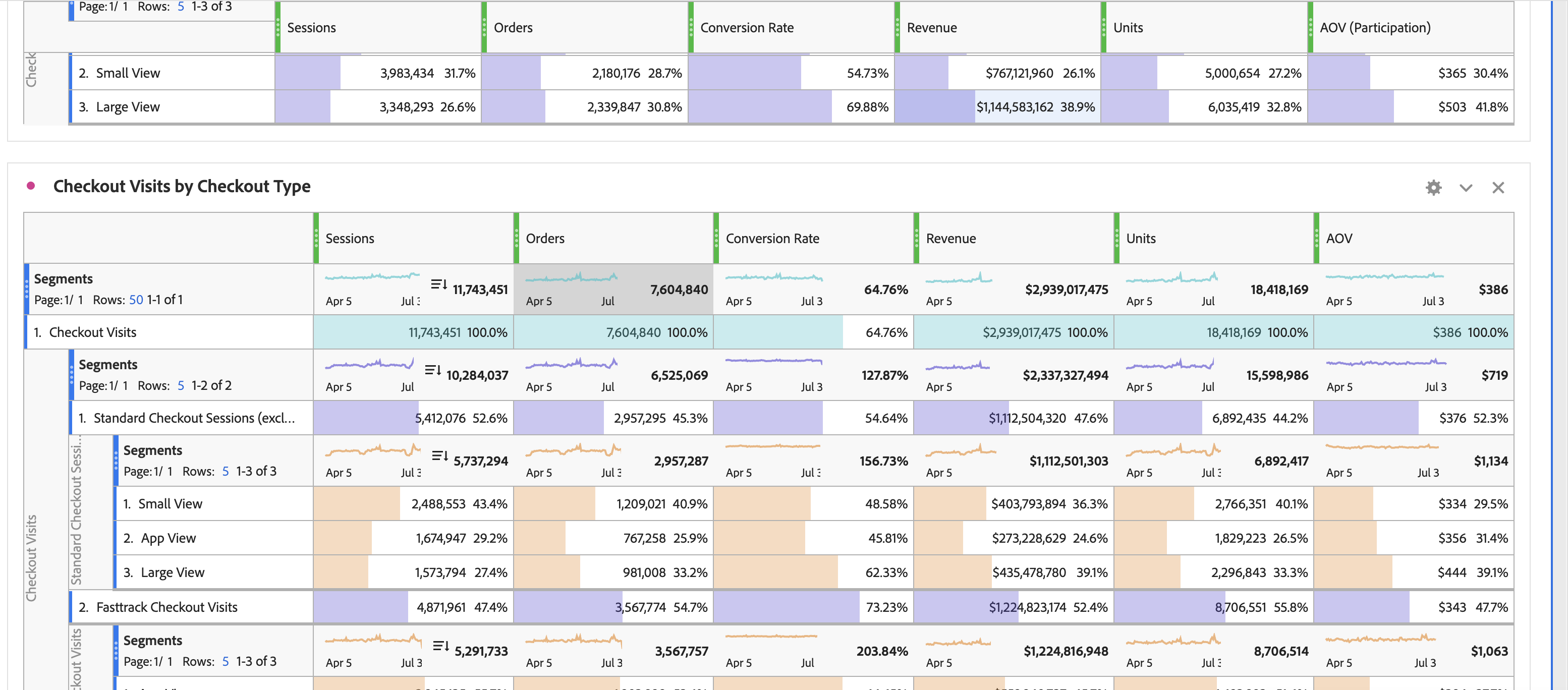
Adobe Analytics — checkout visits by type
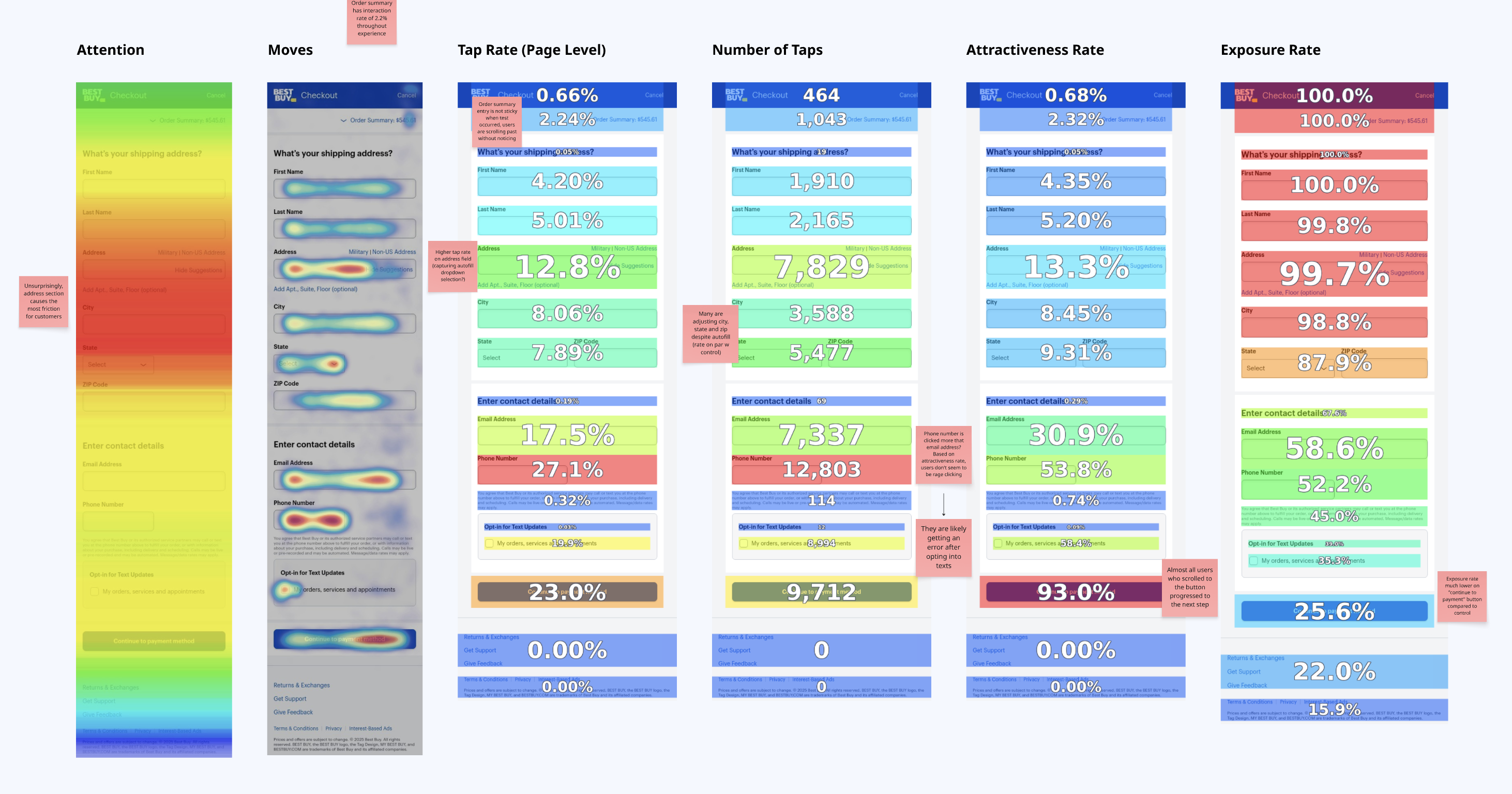
ContentSquare — six lenses on one page
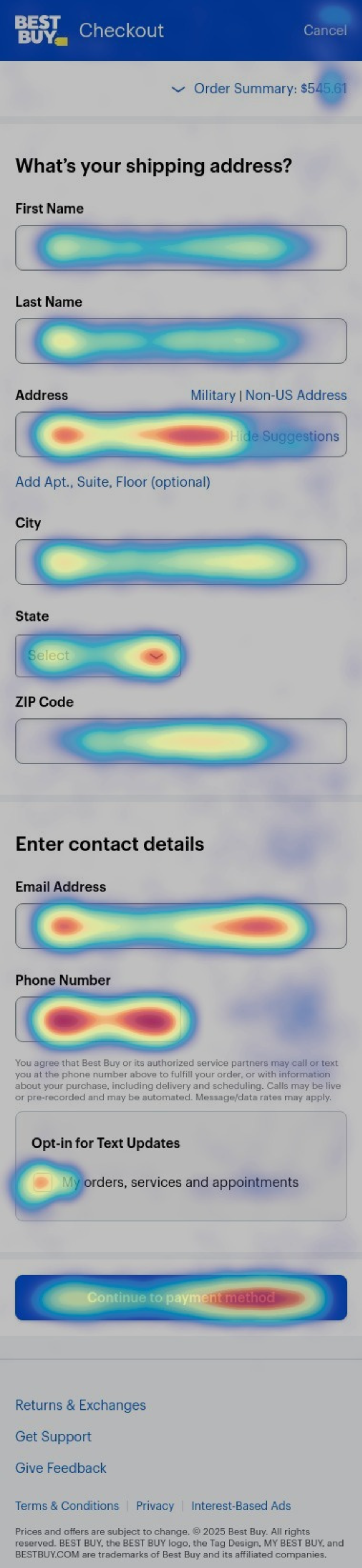
Heatmap — where effort concentrated
Customer Need 01
Customers Need Fulfillment Information Earlier
One theme appeared across nearly every data source. Customers wanted more confidence in delivery timing and costs before investing time in checkout.
Of participants reported abandoning purchases because of delivery timing concerns
Reported abandoning purchases because of shipping or delivery costs
Customers returned to the cart page from checkout in test checkout compared to control
Customers weren’t waiting until the end to think about fulfillment. They wanted to understand delivery options much earlier in the process.
Customer Need 02
Customers Need To Review Before They Pay
Analytics, customer feedback, and research all pointed toward the same behavior. Customers want the opportunity to verify their order before committing.
- In a survey of 250+ users, participants consistently placed Order Review before Payment
- In user research, users frequently mentioned wanting to double-check information before purchase
- The previous redesign validated the importance of review, even if the overall experience failed
“Clicked final review to make purchase and nothing happens, guess you don’t want my money.”— Customer survey feedback
The question wasn’t whether customers wanted review. The question was how to make information reviewable without creating unnecessary friction.
Customer Need 03
Customers Need More Control
One of the most surprising findings came from fulfillment behavior. Customers were significantly less likely to change fulfillment methods in the redesign.
In the test:
- “Change fulfillment method” interaction dropped from 16.1% in control, to 3.5% in test
- More users used alternative payment methods rather than credit cards
- Evaluative research found that the credit card selector was confused with a form field
Mistaken for a form field
“The default list of addresses for me to choose from my profile is gone.”— Study participant
Customers clear editability throughout checkout. Not just on the last step.
Too little confidence.
As we synthesized findings, a broader pattern emerged. Customers weren’t provided any information about their order until the review step. They struggled because they lacked confidence throughout the experience.
Across every source, the same themes appeared:
- Confidence — can I trust what I’m seeing?
- Reviewability — can I verify my order?
- Control — can I make changes easily?
- Transparency — what happens next?
Defining the problem space
I facilitated hypothesis workshops to transform findings into actionable opportunity areas. The goal wasn’t to generate solutions. The goal was to agree on which customer needs mattered most.
Which checkout model best supports our customers?
Once we aligned on customer needs, we explored multiple checkout models. Rather than asking which design looked best, we evaluated which model best supported the opportunities uncovered during discovery.
| Model | Confidence | Reviewability | Control | Transparency | Mobile usability |
|---|---|---|---|---|---|
| Multi-page | ○ | ○ | ○ | ◐ | ◐ |
| Multi-page with progress | ◐ | ◐ | ○ | ◐ | ◐ |
| One-page accordion | ● | ● | ● | ● | ● |
| One-page overlay | ○ | ● | ◐ | ◐ | ● |
A shared long-term vision.
The one-page accordion model consistently addressed the needs uncovered during discovery. By keeping information visible while progressively guiding customers through checkout, the model offered stronger reviewability, transparency, and control.
More importantly, it aligned Checkout, Payments, and Fulfillment around a shared long-term vision.
1 Shipping

2 Contact

3 Payment

Since then, I designed the full checkout process and undergone A/B testing where the new 1-page checkout succeeded! We will be scaling the experience to all customers soon!
The most valuable outcome was shared understanding.
This project changed how I think about design leadership. The most valuable outcome wasn’t choosing a checkout model. It was creating shared understanding.
The previous redesign left teams focused on whether a solution failed. The workshops helped us focus on why customers were struggling in the first place. Once Checkout, Payments, and Fulfillment aligned on the problem, the path forward became much clearer.
Sometimes the most important design work isn’t creating a solution. It’s helping a team see the right problem together.
Building the future of checkout
Designing the one-page checkout end to end, and protecting the direction through complexity, constraints, and experimentation.
View case study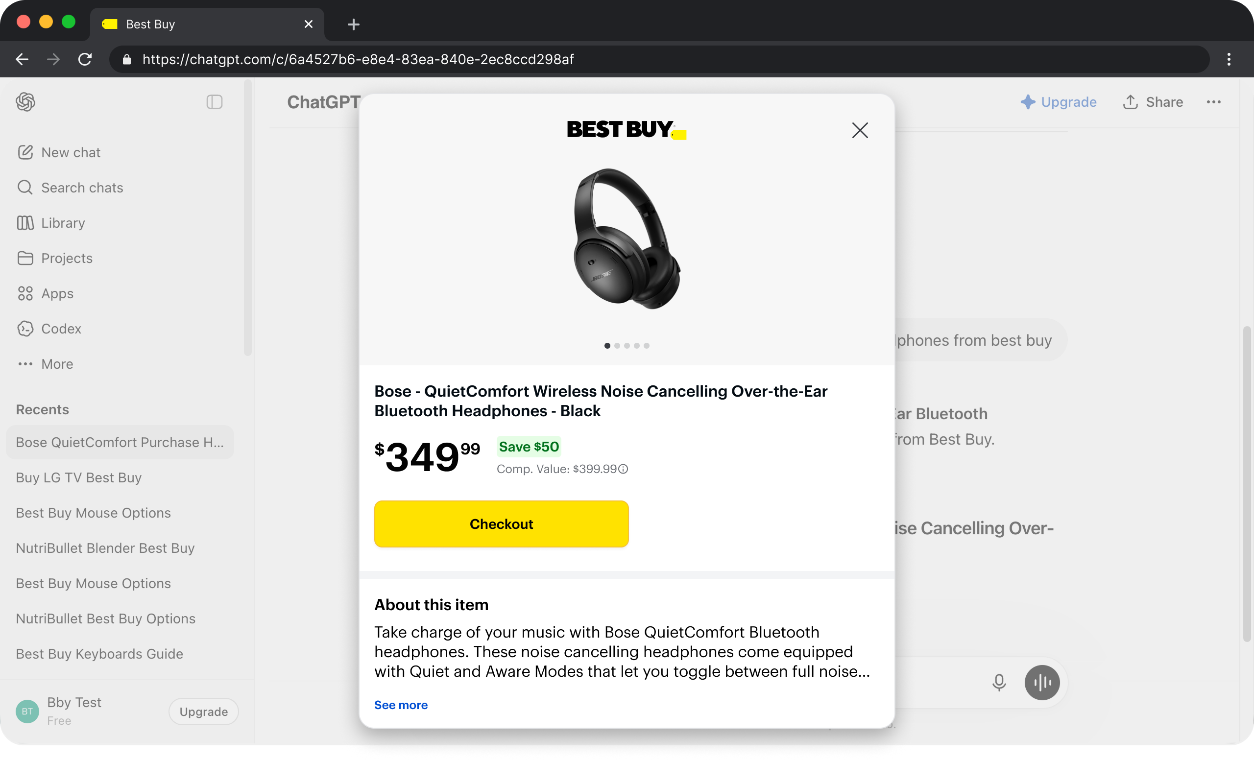
The future of agentic commerce
Leading the design of Best Buy’s first AI-native purchasing experience — a complete checkout inside ChatGPT, across OpenAI, Stripe, and Best Buy.
View case study